
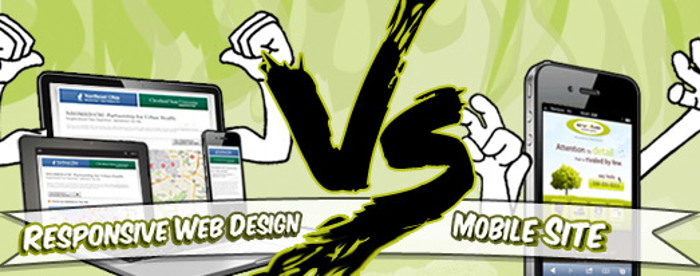
Responsive Web Design vs Mobile Site: Which is Better?
Mobile growth usage has spiked over the last few years, with 64 percent of Americans already owning a smartphone and using the device to do a wide range of activities, according to the Pew Research Center. Take a look at some of the facts:
- 62 percent of these smartphone owners have used their units to look up health conditions
- 57 percent do online banking with their units
- 44 percent have used their smartphones to browse through real estate listings or sites to help them find a place to live in
- 43 percent use it to find information about job opportunities
- 40 percent use it to read up on government services or information
- 30 percent use their smartphone units to go to classes online or get access to educational materials
- 18 percent use their smart mobile phones to send a job application
Going Where The Market Is
From online banking to shopping, mobile use is now more widespread than ever. For businesses that have e-commerce sites, that means playing catch-up or ensuring that their sites are mobile-friendly as well. After all, one of the first rules in business is that you need to be where your market is. Given the huge number of mobile users, it makes perfect sense to go with a mobile-friendly site. Implementing changes to make this happen will help you provide your customers with a better user experience, one that will hopefully make them want to stay on your pages that much longer—instead of driving them away with a sprawl of unwieldy navigation and viewing options.
Mobile Site
Before mobile use hit its stride, e-commerce sites resorted to the implementation of mobile sites. At that time, only 28 percent of the population was using smartphones to access the Web, according to Smashing Magazine. These days, the numbers are far bigger.
Mobile sites are a version of your site designed to fit into smaller screens typical of a smartphone. It’s basically a copy of your site, one that’s smaller and easier for customers to navigate. So when customers try to visit your site via mobile, you basically send them over to another site that is mobile-friendly one.
The downside? Instead of using your resources to manage one site, you need to look after two instead, says Business 2 Community. So if you need to change or revise a few pages, roll out site improvements and change any other element onsite, you need to do the same set of improvements, changes and revisions to the mobile site as well. That takes considerable time and effort, increasing the chances of errors in either of the sites. It’s also incredibly tedious. After all, you already lose out on the time it takes you to manage the second site. Having to roll out all the changes you need twice can tie you up for far too long. If you’re working under a tight deadline, this can derail your time table in a big way.
Responsive Web Design
With responsive web design, you eliminate the biggest hassle that comes with mobile-friendly versions of your site: spending all that time and resources managing a second site.
The device essentially does all the work for you so you don’t have to implement changes every single time. Whether your customers are accessing your site via mobile, tablet or laptop, your site will automatically adjust to the size (small or large?) and orientation (landscape or portrait?) of the screen. And the best part? The changes happen instantaneously.
Also, unlike mobile sites where you need to use another domain—something detrimental to your efforts to boost your search rankings— responsive web design allows you to keep yours. That way, it doesn’t hurt your organic search traffic. All searches to your site go to your primary site, undivided by searches to your mobile site. This option allows you to say goodbye to mobile redirects for good.
In addition, going for responsive web design means you are choosing a design that’s going to last you for the long-term. With mobile sites, you have to keep creating a new version. With responsive web design, though, all you need to do is update your site to ensure it works seamlessly with the next generation of gadgets, from phones and tablets, to new laptops and browsers that come out in the market. Your design allows your site to adjust to the use of future devices without a major overhaul of your programming. That means less site upkeep and maintenance costs in the future for you, and more for your bottom line. So if you want to make sure your site is ready for the future, opting for responsive web design is a truly ideal solution for your business.
Getting Help
If you’ve pitted the thought of a mobile site—and the thought of managing two sites instead of one—against getting a responsive web design long enough and hard enough, discussed all the pros and cons until you’ve got them down pat, and finally come to a conclusion, then the next course of action to take should focus on getting professional help. An affordable SEO company that can help you roll out the changes you want in your site. By getting professional help, you can be sure about the results you’re going to get. And the sooner you can get in touch with them, the sooner the changes begin.
Seeing the Future
So if you don’t want to get left behind by your competition, start playing catch-up. Find a way to implement the changes you need now. The sooner you have a mobile-friendly site, the easier your customers can find you online.
If you want to be a part of the conversation, if you want to reach your customers where it matters to them, then having a mobile-friendly site is no longer just ‘a nice feature to have.’ For ecommerce businesses like yours that want a chance at winning a wider slice of the consumer pie, it’s now a ‘must-have’.
Source: smallbusinesscan.com

